The Client
Based in Detroit, Gleaners serves as a critical link in the local food supply chain, supplying food to nearly 400 partner organizations including soup kitchens, food pantries, shelters, schools, and more. They go above and beyond by hosting direct service drive-up grocery distributions to further support their partners. Working with Gleaners Community Food Bank on their design projects has been truly rewarding. It’s a great feeling, using my design skills to help an organization that’s making a difference in the community.
Logo Design
I’m particularly proud of designing Gleaners’ current logo. When they approached us to refresh their logo for their 40th anniversary, they had a unique vision in mind. They wanted the logo to pay homage to an old painted sign from their early days, featuring some funky 70s typography. My task was to reinterpret this vintage lettering into a fresh, modern logo. I opted for a hands-on approach, starting with tracing paper to hand draw the lettering before vectorizing it for the final design.
Harvest Magazine
For several years, I had the privilege of working on Gleaners’ annual publication, “Harvest.” This dual-purpose magazine not only showcased their Annual Report but also served as an informative resource for their supporters. Leading the art direction, layout, and assembly of these publications was a multi-month endeavor. One of the highlights was conducting onsite press-checks with the client, witnessing the final product come to life on the printing press.


Other Projects


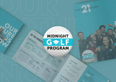

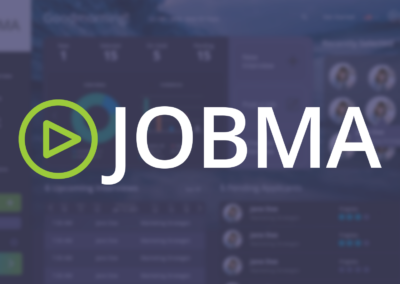


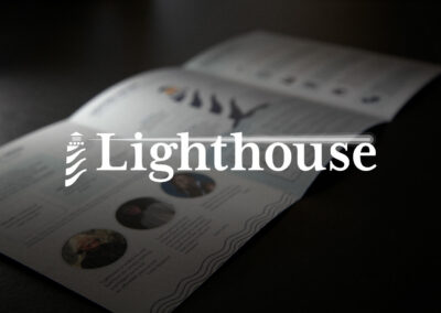
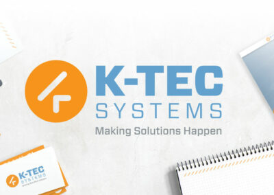
There's much more to talk about
But somethings are better left for one-on-one, in the interest of client privacy I can’t openly post about all my past work or experiences, but i’d be happy to schedule a meeting to discuss further.

Copyright 2024 / All Rights Reserved to Their Respective Entities